Dear Vision Zero SF Team,
Subject: Proposal for the Redesign of Pedestrian Walk Signage to Promote Ergonomic Posture
I am writing to propose a redesign of San Francisco’s pedestrian walk signals. As a concerned citizen passionate about public health and urban design, I believe it is crucial to encourage healthy walking habits through every means, including street signage.
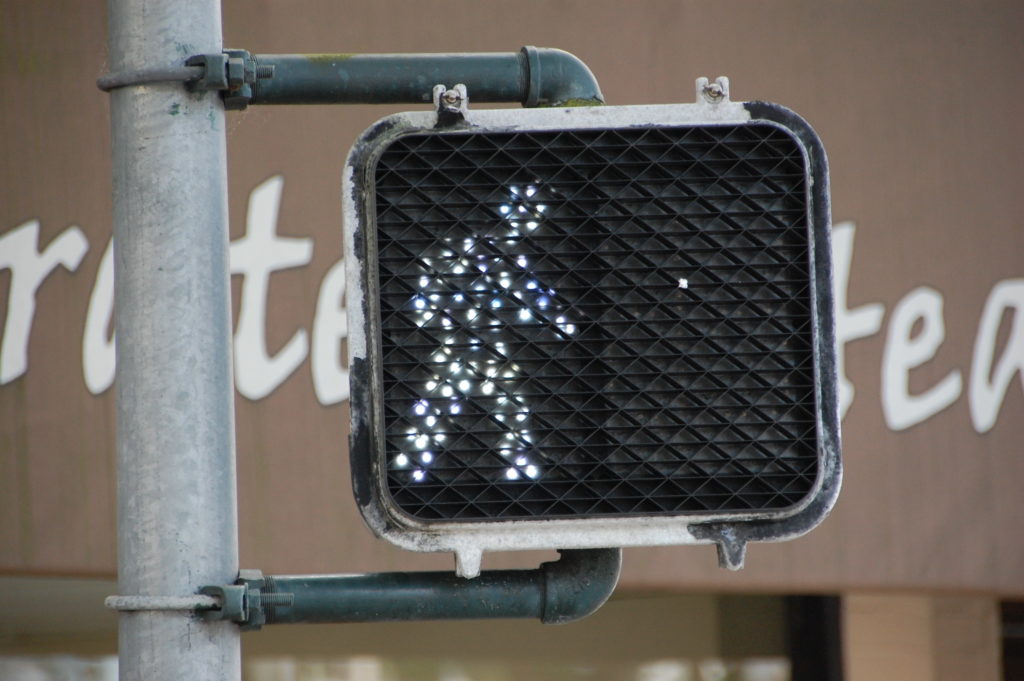
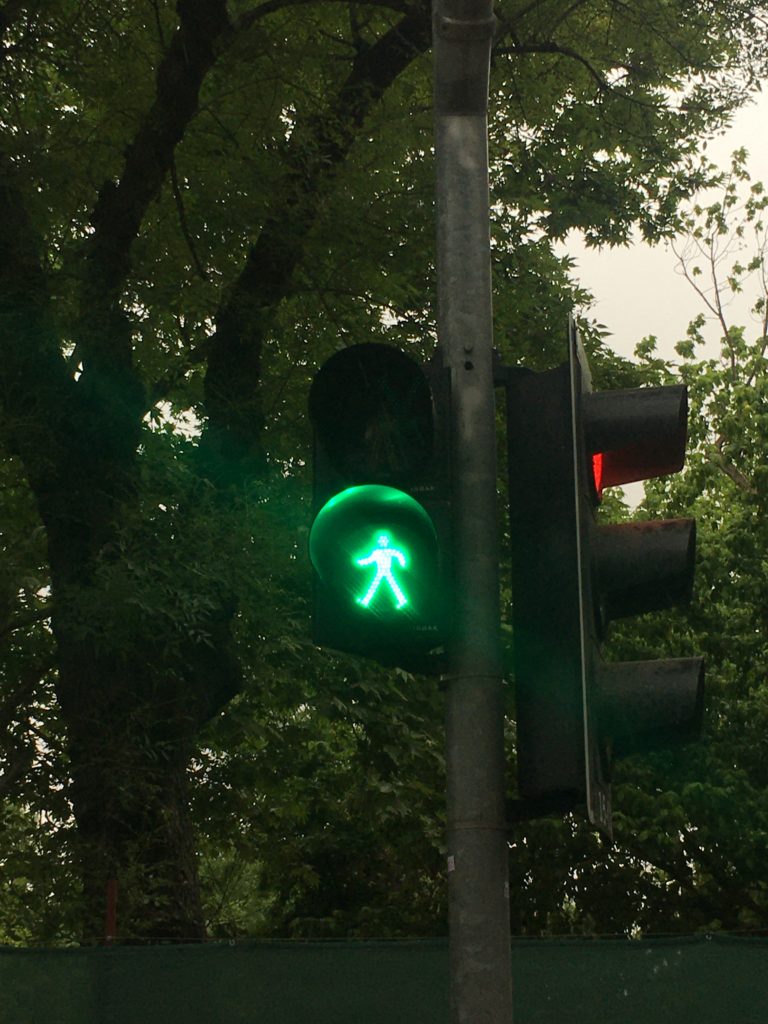
The current walk signals depict a figure in motion. However, this figure demonstrates a forward-leaning gait, which is not ergonomically optimal and focused on the street immediately ahead. As we aim to promote safety and well-being, our walk signs should reflect a posture that is upright and attentive, encouraging pedestrians to adopt a healthier walking posture.
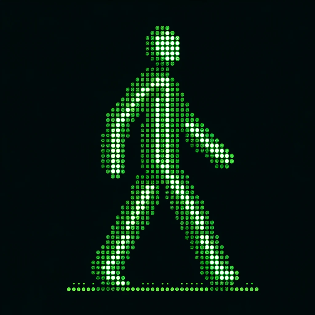
I propose a walk signal with a figure that stands tall, has a straight back, and a head level with the eyes looking straight ahead. This posture encourages a neutral spine alignment and reduces the potential for musculoskeletal strain. I have attached a visual mock-up of the proposed design, highlighting these features.
The benefits of this redesign are manifold:
- Promotes Correct Walking Posture: By demonstrating ideal posture, we can subtly influence pedestrians to walk correctly.
- Enhances Pedestrian Safety: An upright posture ensures better visibility of the surroundings, thereby enhancing safety.
- Aligns with Public Health Goals: Encouraging correct posture aligns with broader public health initiatives aimed at preventing long-term health issues.
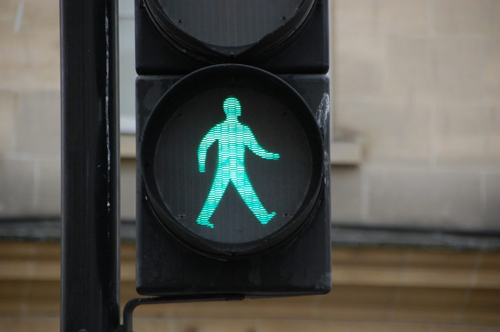
There is precedent for such designs. For example, the Bath, Great Britain walk sign shows a more upright figure. Studies in ergonomics also support the need for promoting correct walking posture as a preventive measure against various ailments.
The implementation of this new design can be a phased process, aligning with the replacement cycle of current signage to minimize costs. Additionally, the new signs can be piloted in a few neighborhoods to gather public feedback before city-wide adoption.
In conclusion, redesigning our pedestrian walk signals can serve as a small but significant step towards a healthier San Francisco. It supports Vision Zero SF’s goal of ensuring our streets are not only safe but also promote the well-being of all pedestrians.
.
Reply from the SFMTA:
“Hello. Interesting observation about posture, hadn’t ever noticed that aspect of the symbol. The symbols used in the United States are established by the federal government, so SFMTA really doesn’t have much say on what type of pedestrian symbols or signs we can use. In order to encourage national uniformity we follow the same design that other cities have in the United States. More details on this standards process are here: https://mutcd.fhwa.dot.gov/kno-overview.htm. To change the symbols used you would have to submit a comment or suggestion to the FHWA’s MUTCD team.
Actually, the new edition was released just today, so you can google “MUTCD” later to see articles about how this process works and reactions to the new version. I’m pretty sure they didn’t update the symbol, however, but there’s always tomorrow.
Federal Register :: National Standards for Traffic Control Devices; the Manual on Uniform Traffic Control Devices for Streets and Highways; Revision“

